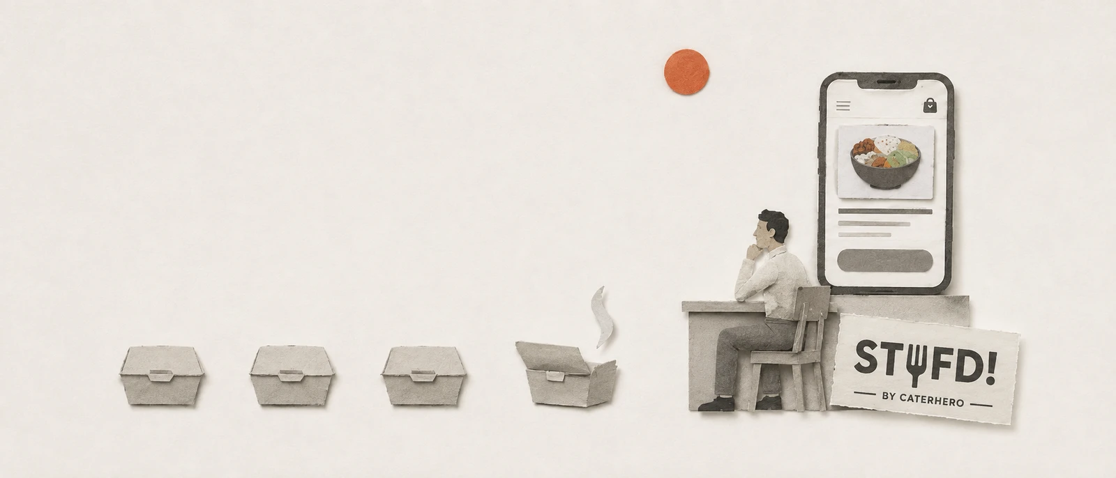
Designed for the hundredth order, not the first.
CaterHero delivers office meals by coordinating a network of caterers behind the scenes. Stufd is the app the employee installs and orders from. The design problem was not one transaction. It was a habit: decide lunch in seconds, spend an allowance the employer already funded, and always know where the food is.
The problem
Office lunch is a habit, not a purchase.
Most food apps are designed for the first order. This one had to be designed for the hundredth. The job is not to sell a meal: it is to strip the friction from a thing that repeats. Make the choice tiny, make paying invisible, make "where is my food" answerable at a glance.
And there is a twist the design quietly assumes: most of the time the employee is not the one paying. Their company funds a meal allowance, the app spends it down, and the bill only reaches them past the limit. Less a shop, more a benefit you use. One note on names: CaterHero is the company and the logistics. Stufd is the brand on the app. One product, two faces.
How I thought about it
Design the daily loop, not the first visit.
Every important decision came from treating the user as a returning regular, not a curious newcomer. Four of them carry the product.
Built for reorder, not discovery
Home leads with favourites, and history reads as a reorder surface, not a receipt archive. The default user has done this before and wants out fast.
A wallet that holds a company allowance
HR tops the balance up, lunch draws it down. No card, no payment screen, just a tap against money that is already there.
Subscriptions as a first-class mode
Set-and-forget meals sit in the bottom nav beside Home, not buried in a setting. For a daily habit, routine is a primary path.
Status you read at a glance
Placed, being prepared, delivered at your office reception, on one clear line. The most common question, answered before it is asked.
The app, screen by screen
The whole daily loop.
Browse a menu, read a plate, pay from the wallet, set tomorrow's lunch, watch it arrive.
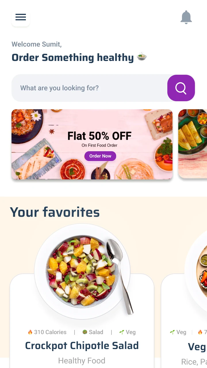
Decide in secondsFavourites first. The greeting says healthy, on purpose.
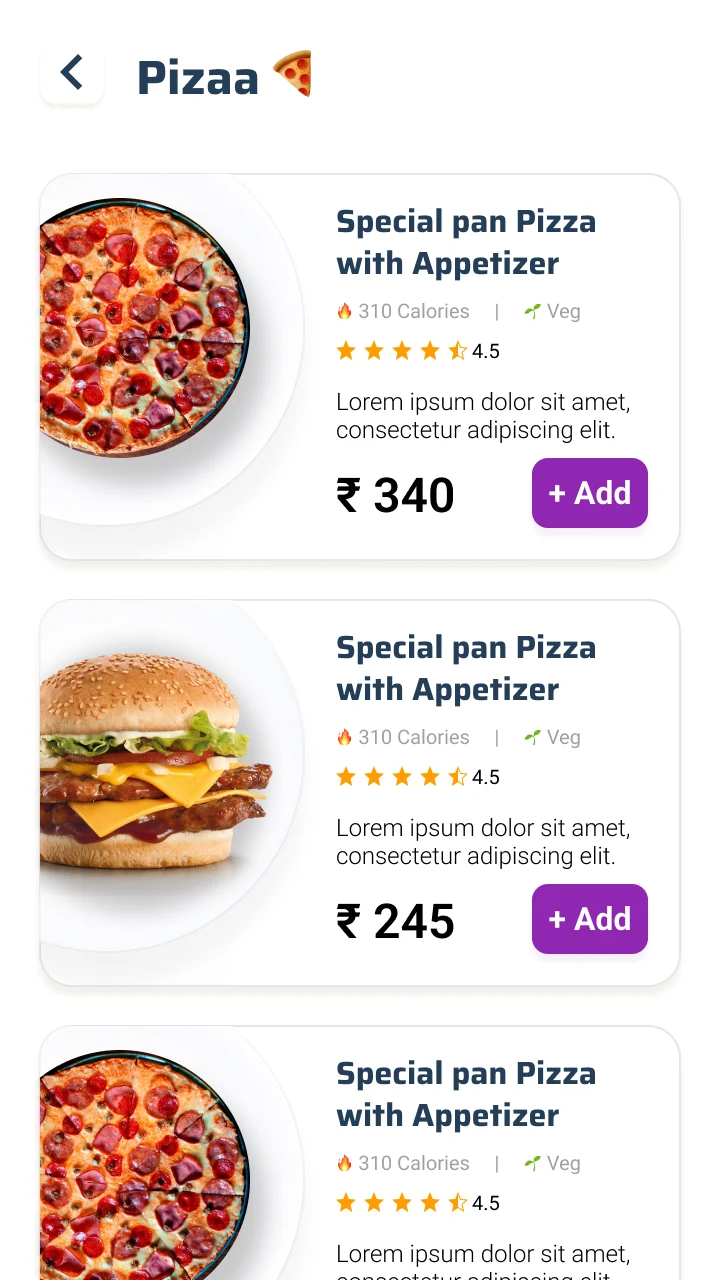
Enough to chooseCalories, veg, rating, price on every card.
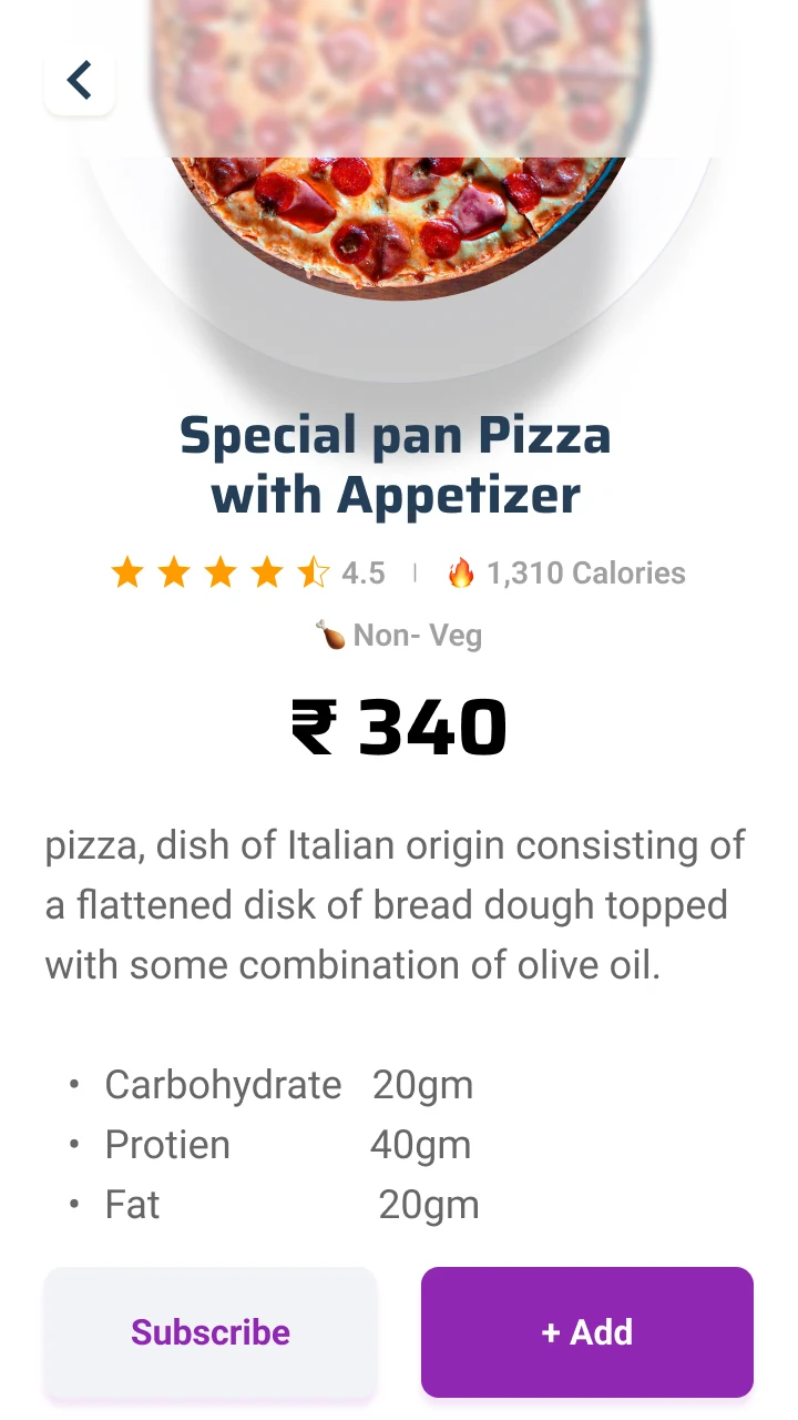
The plate, in numbersNutrition and a Subscribe button, side by side.
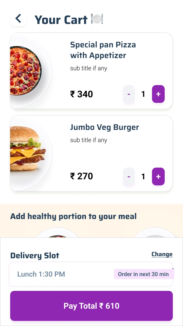
One tap to paidA delivery slot and a total. Nothing else to fill.
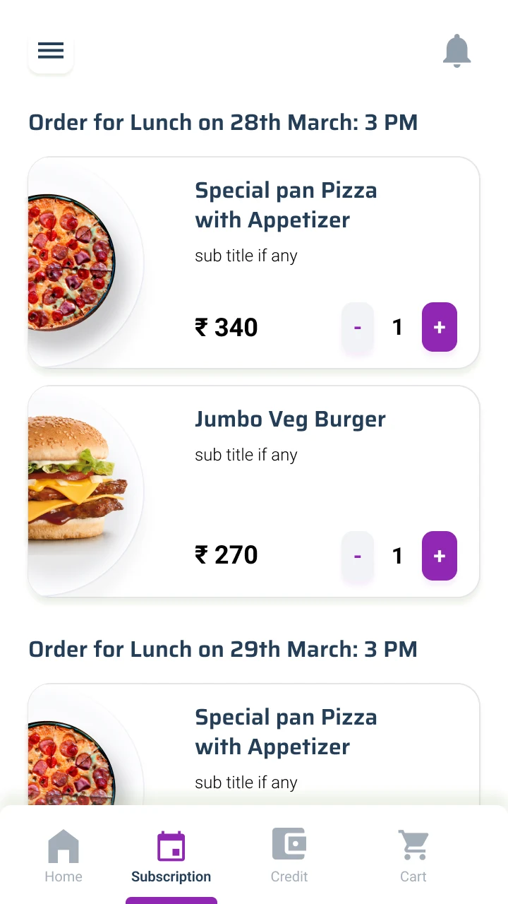
Tomorrow, set todayScheduled meals, one tab from Home.
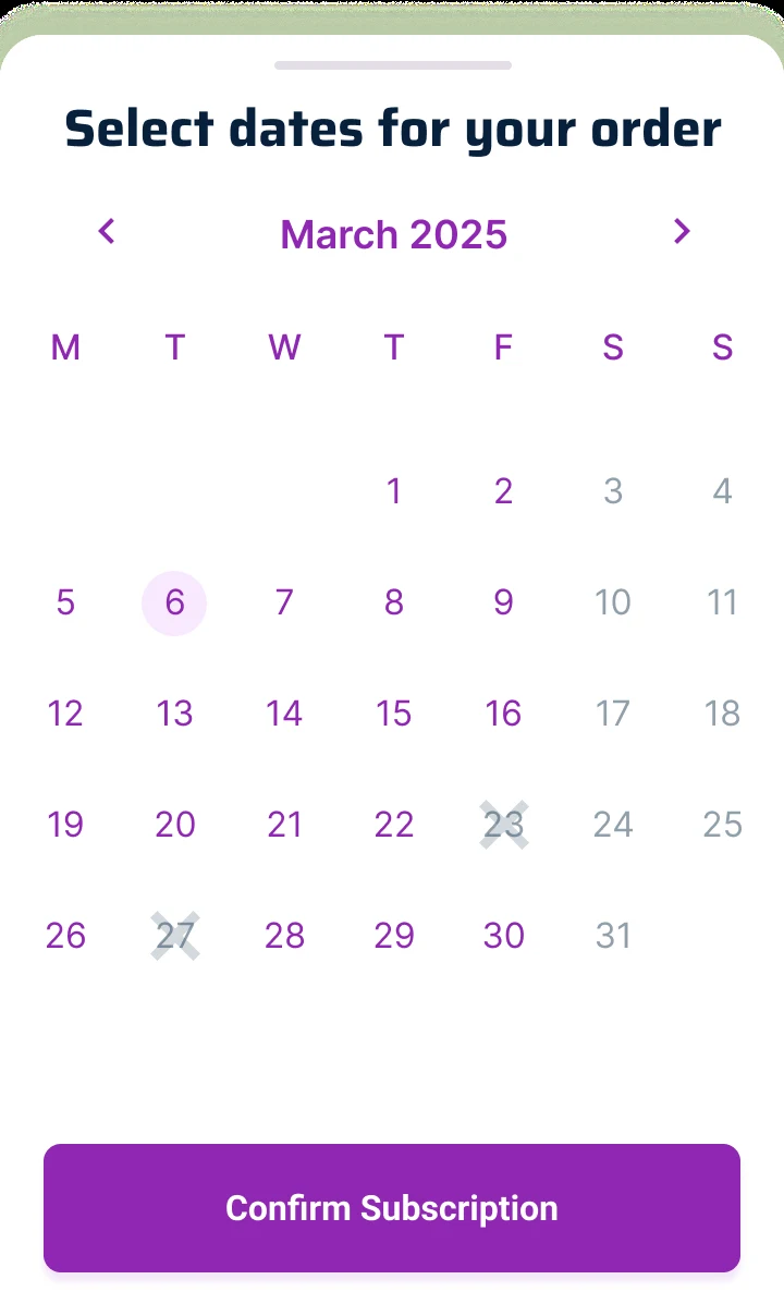
A week in one pickDate ranges, not one order at a time.
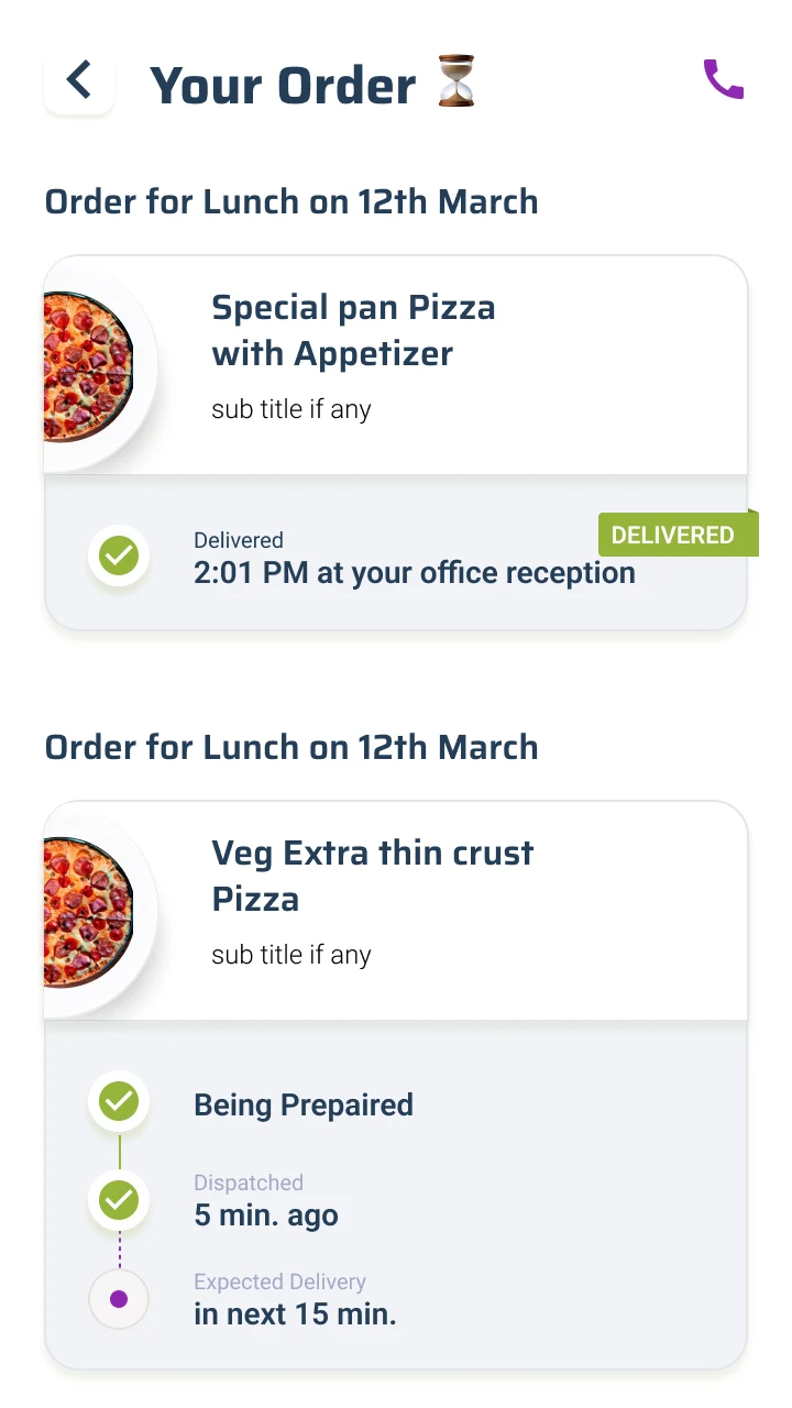
Where is my foodAnswered on one line, down to the reception desk.
More of the app
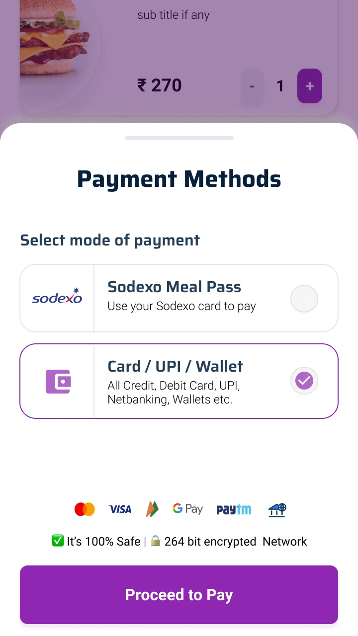
Meal-pass readySodexo first. This is office India.
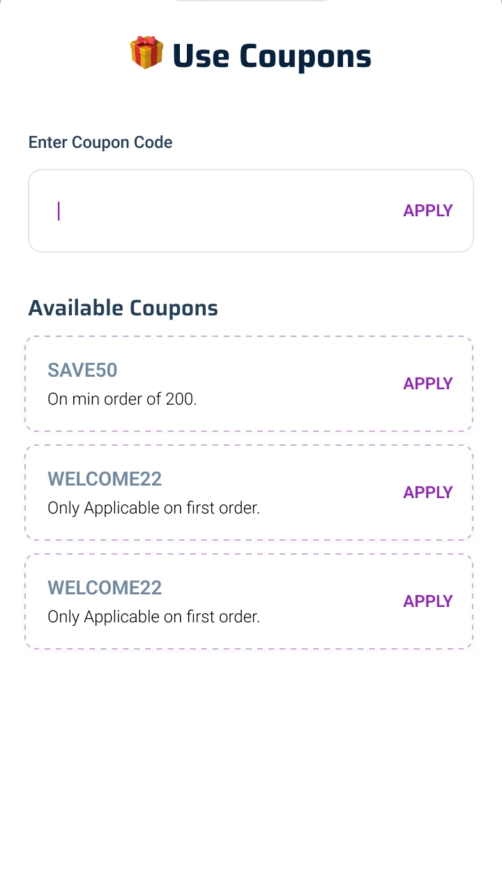
CouponsSurfaced in the cart, on purpose.
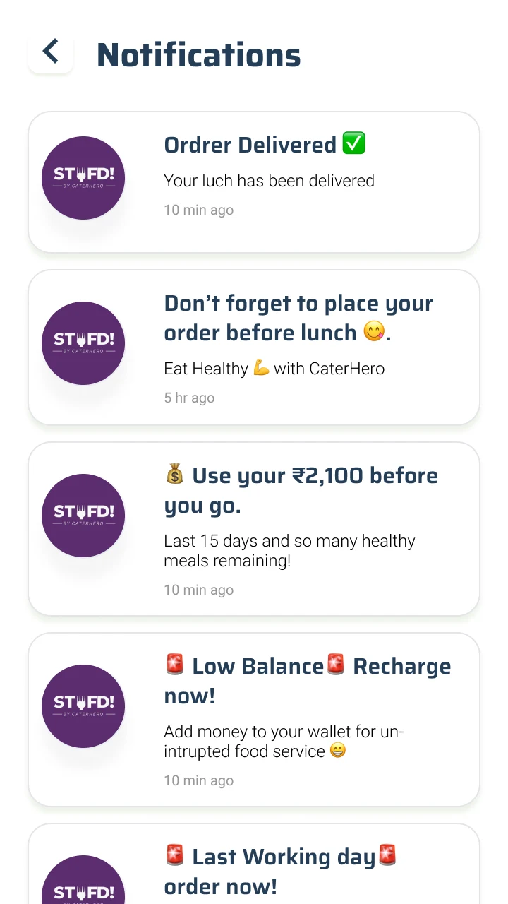
NudgesUse it before you lose it. Routine, protected.
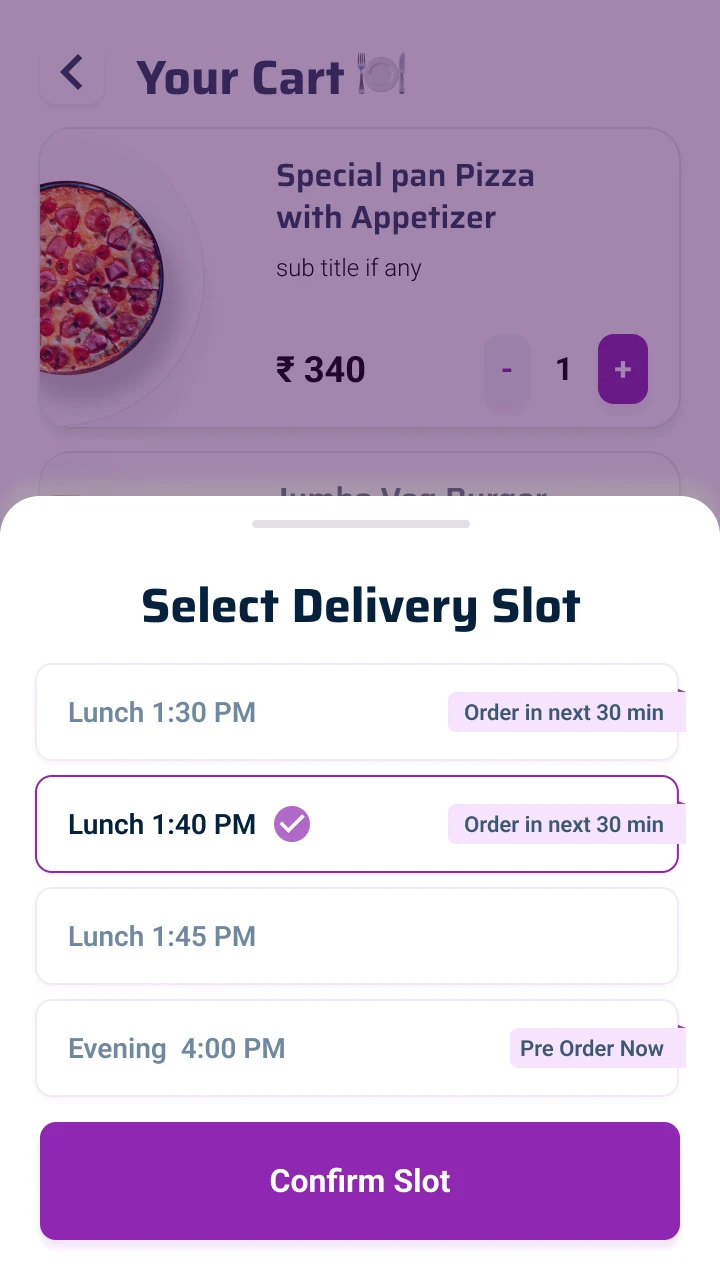
SlotsLunch now, evening pre-ordered.
Walk the app yourself
Two flows, live from the handoff: the whole app, and the homepage on its own. Tap through them the way a diner would.
The decision that carries it
One ledger explains the whole model.
The clearest screen in the app is the wallet. Read its ledger: a large credit lands from the company, then a string of small lunches draws it down, day after working day. The diner never reaches for a card. They are spending an allowance someone else already topped up.
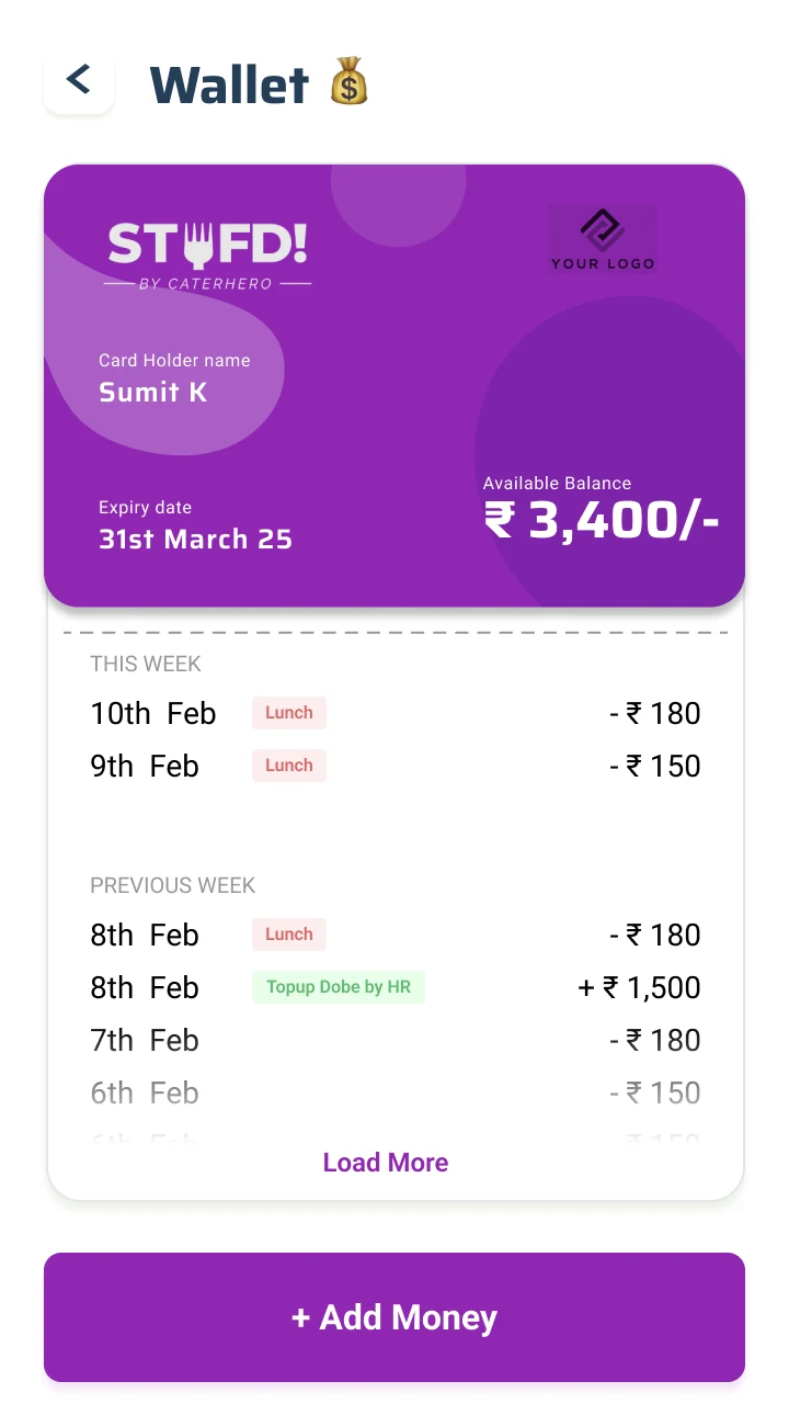
The card reads STUFD! by CaterHero and the app keeps a slot for the employer's own logo: a workplace benefit wearing the clothes of a consumer app.
A layer most food apps skip
Lunch, turned into a quiet office game.
The home screen does not say order food. It says order something healthy, and the design backs it up: every meal carries its calories, the app keeps a monthly average, and that number rolls up into a leaderboard of colleagues. Comparison is a sharp instrument, so it is kept deliberately blunt: a number to notice, a gentle rank, never a nag.
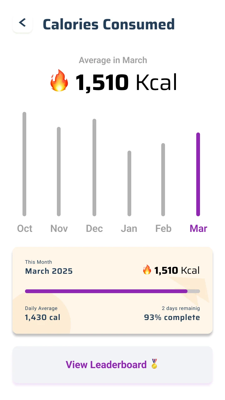
A monthly averageA number to notice, not a guilt trip.
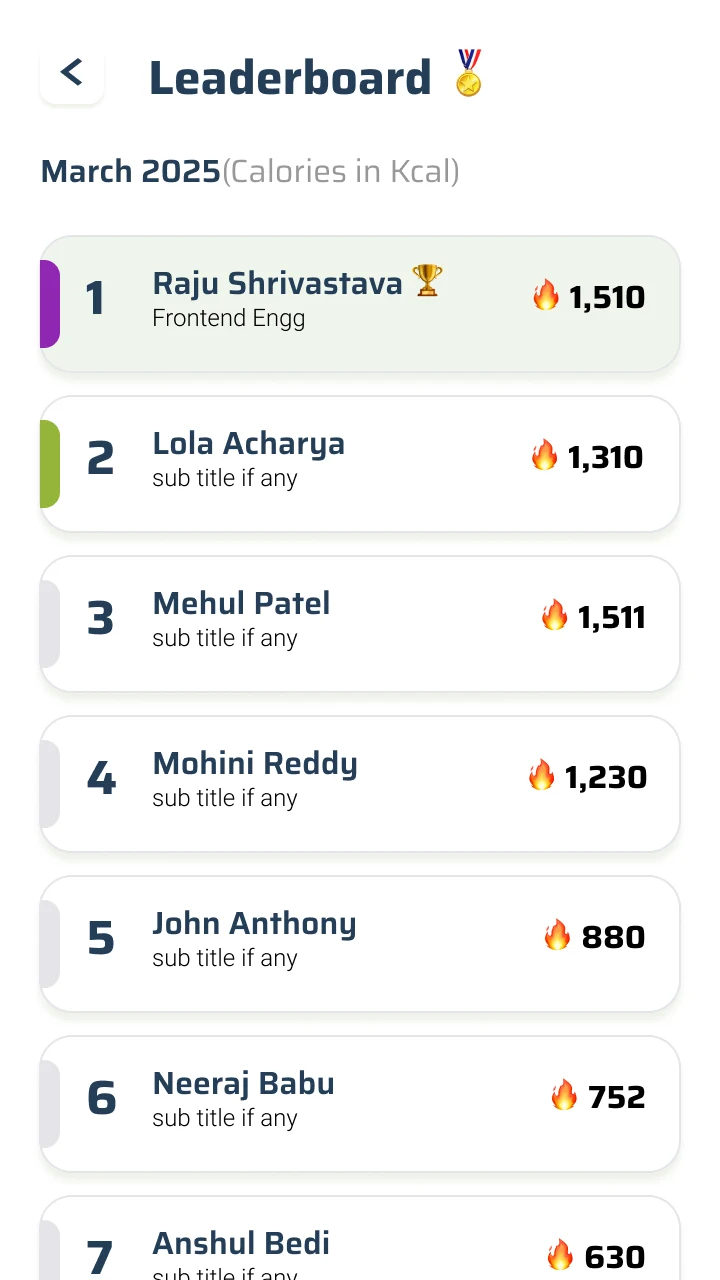
Your team, rankedLightly competitive, deliberately gentle.
What this shows
Shipped, and sustained.
A real consumer product taken to both app stores: one skeleton, refined release after release.
The public store numbers are early-stage, so the claim is range and craft, not scale.
What carries forward
For a daily product, the lever is friction, not features.
It is tempting to add to a product like this. The discipline is to take away. Every tap between a hungry person and their usual lunch is a tax they pay every working day, so the wins came from removing steps: a wallet instead of a card field, favourites instead of a search, a subscription instead of a daily decision. Designing for a habit is mostly the art of getting out of the way.
Role and credit: product design for Stufd, client work for CaterHero Technologies Pvt Ltd, Mumbai.
Ask AI about this case Live
Answers come from what this case actually says. Pick a lens, ask as many as you like.
Summarize this case
1. CaterHero delivers office meals by coordinating a network of caterers; Stufd is the app the employee installs and orders from. One product, two faces.
2. Office lunch is a habit, not a purchase, so I designed for the hundredth order: favourites and reorder up front, an HR-funded wallet instead of a card, subscriptions beside Home, and order status you read at a glance.
3. The wallet is the whole model in one screen: the employer tops the balance up, lunch draws it down, the diner never reaches for a card.
4. Client work, shipped to both app stores and sustained release after release. The store numbers are early-stage, so the claim is range and craft, not scale.