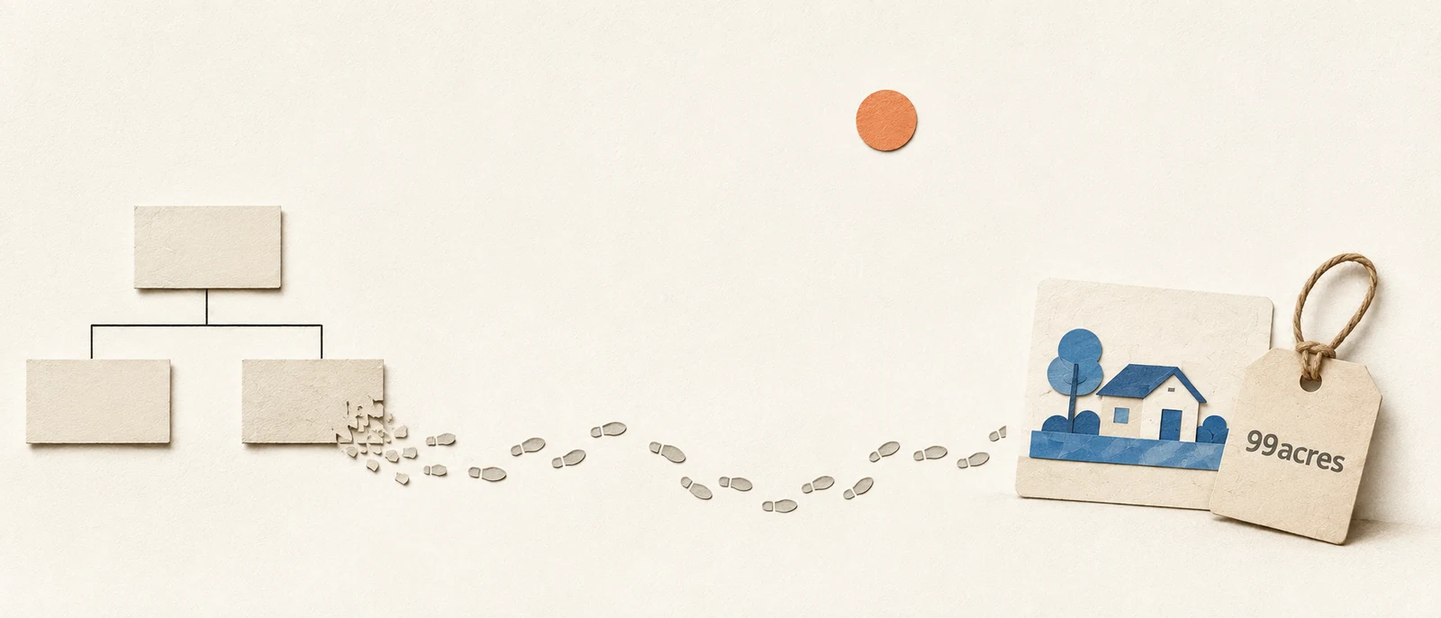
Our search was built in the shape of the org chart, not the buyer.
On India's largest property platform, search is the engine the whole business runs on. The brief said fix the form. I led the redesign of search end to end, mobile, apps and desktop, and turned a cleaner search for buyers into new revenue for the business.
02 /The reframe
The form gave buy, projects and rent equal billing, as if intent and inventory were the same thing.
The conditions that made this hard
In a classifieds model, lead volume dictates monetization, and 90%+ of leads originate in search. Most of that traffic arrives on its own, around 60% organic, and only about a tenth of visitors are ones the business can directly target. The surface itself has to do the persuading. There is no second channel to fall back on. And the form was only the front door: a buyer could reach results seven to nine different ways. Fixing search meant fixing every one of them.
03 /Earning the right to touch it
Search is the spine of a classifieds business. Nobody wanted to touch it.
How I earned the right
Most of the product is powered by search, so changing it felt like operating on a running heart. It took months to convince stakeholders that it was worth the risk. Having been in the system across many projects, I could read signals others couldn't, and I used that standing, as the design lead mentoring the team, to do something structural: instead of letting the monetization work sit in separate pockets, I folded it into the core search objective. The advertiser-inventory project (Campaign Manager) stopped being a side track and became part of how search itself works.
The right property surfaces at the right moment, while they are still figuring out what they want.
New, monetizable inventory and reach for builders and channel partners, on the surface every buyer already passes through.
04 /How I thought about it
We started with a question, not a layout: what is search, before it is a form?
Go deeper: the buyer archetypes, the experience map & the ISP mechanics
Search is a learning behaviour, not a database query. I mapped it as the Information Seeking Process: a non-linear path where a buyer's confidence dips through exploration before it recovers, so the job of the interface changes stage by stage. Open up options early, and help the buyer commit later.
Decisions came from triangulating three things: behaviour across millions of sessions, cues from 60+ user interviews, and the statistics underneath. Every change was then proven with a controlled experiment before a wider rollout. Lead with evidence, and never break the thing while improving it.
The model was abstract on purpose, so we grounded it in six buyer archetypes drawn from the interviews and telemetry (the patient investor through to the buyer who wants to move in next month), mapped stage by stage against what each was trying to do and expected. The base it sat on: 95% of sessions came from returning users, 87% of buyers were 18–44, and 62% searched on the mobile site.
The full ISP stages (Initiation → Selection → Exploration → Formulation → Collection → Action), the confidence and requirement curves, and the per-archetype experience map live here rather than in the main read. They were the working model. The page above is the conclusion.
05 /From a form to a conversation
We turned a flat form into a conversation.
The old form sprayed every database field onto one screen: pick a tab, then parse the rest. We rebuilt it the way a good broker actually talks to a buyer, one question at a time, in the order a person thinks. Each field became a question, not a field. Minimum friction, minimum mental load, the digital version of a conversation a buyer already knows how to have.
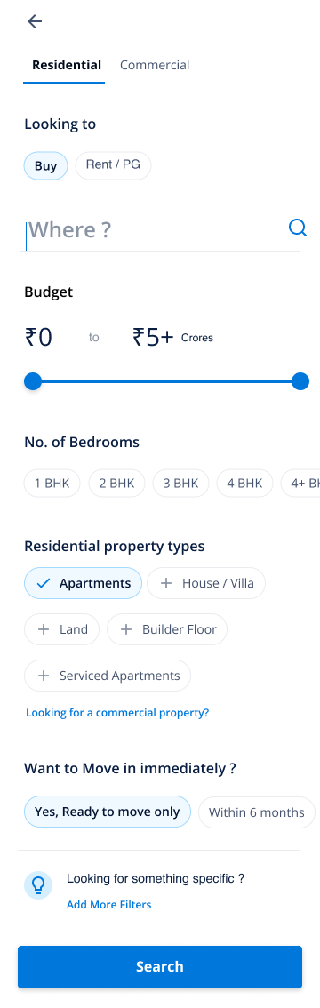
Decision by decision, here's how the conversation got built.
A project is inventory, not intent. So intent leads.
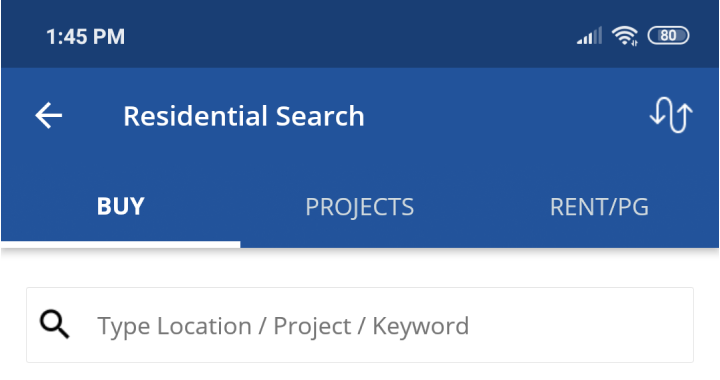
The legacy form gave Buy, Projects and Rent equal billing as tabs, mixing what the buyer wants with how we file the catalogue. The redesign asks one question first, “Looking to Buy or Rent?”, then handles inventory underneath. The whole frame shifts from the database to the buyer's head.
Intent (buy/rent) and inventory (projects) collapsed into one row of equal tabs.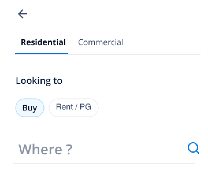 “Looking to” leads with pure intent. Residential vs Commercial and location each get their own clear step.
And one I chose not to build. Stakeholders kept asking for a dual-thumb price-range slider. I deferred it on purpose, to protect the core rebuild and ship the higher-impact changes first. Knowing what not to build, and saying so out loud, is how a project this long stays shippable.
Go deeper: the full decision ledger (the call, the cost, how I de-risked it)
Property type became a full grid, not a horizontal scroll.
The old control hid most choices past the edge of the screen, so what a buyer could even consider depended on the width of their phone. We laid the whole set out at once, with a clear path across to commercial right where someone realises they need it.
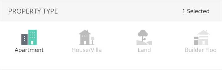 A horizontal scroll: options past the edge were effectively invisible.
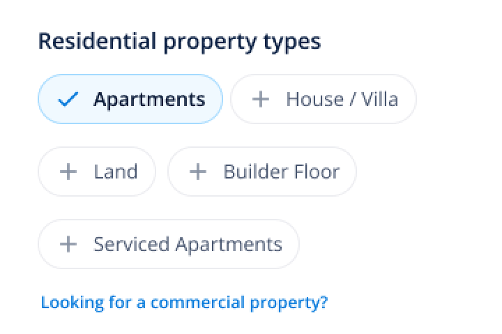 The full set, visible at once, with a route across to commercial.
Bedrooms, clearer and easier to commit to.
The old selector let people pick a 1 and a 3 but skip the 2, a combination almost no real buyer means. We pushed toward a continuous range and shipped a clearer, more touch-friendly selector now, with the full range kept on the roadmap.
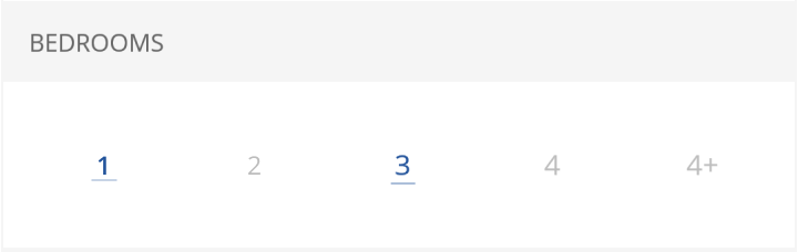 Independent chips: a “1 and 3, not 2” pick no real buyer means.
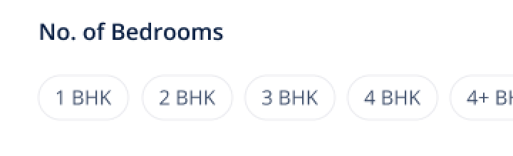 Clearer, bigger targets, read the way people describe a home.
Fixed from day one, built once, reused everywhere.
On a core monetization engine, an unreadable form is lost business. Accessibility was a hard constraint from the start, not a final pass, and the rules were built once and reused system-wide so the form became consistent with the rest of the product.
| Decision | The obvious option | The call I made | What it cost | How I de-risked it |
|---|---|---|---|---|
| Intent vs inventory | Keep Buy / Projects / Rent as equal tabs, like every competitor. | Lead with intent; projects a toggle under Buy. | A familiar entry disappeared; some re-learning. | Matched the buyer's model, shipped progressively, watched drop-off. |
| Bedrooms | Independent chips, any combination. | Move toward a continuous range; ship a clearer selector now. | The full range stayed on the roadmap this cycle. | Checked against real query patterns and usability tests. |
| Property type | A horizontal scroll that fit the phone. | A full grid, every option visible. | More vertical space up front. | Comprehension testing: the grid beat the hidden scroll. |
| Accessibility | Ship now, reach AA “later”. | AAA contrast and 48px targets, hard constraint from day one. | Slower component sign-off early. | Built the rules once, reused system-wide; cost amortised. |
| Projects on results | Blend project cards into the listing rhythm. | Break the pattern so they read as a real choice. | Breaks the visual rhythm. | A/B test: pattern-break won (2.0–2.3% vs 1.3–1.8%). |
| Price-range slider | Build the dual-thumb histogram slider stakeholders asked for. | Deferred it, on purpose. | A visible “power” feature stayed on the backlog. | Scoped out explicitly so the higher-impact changes shipped first. |
06 /The proof
One card system that stays trustworthy when the catalogue doesn't.
Listings are messy: unique photos, the same one reused, no photo, a bare plot, owner posts, premium placements. One card (tuple) system absorbs every case, so the results page keeps its quality even when the data does not.
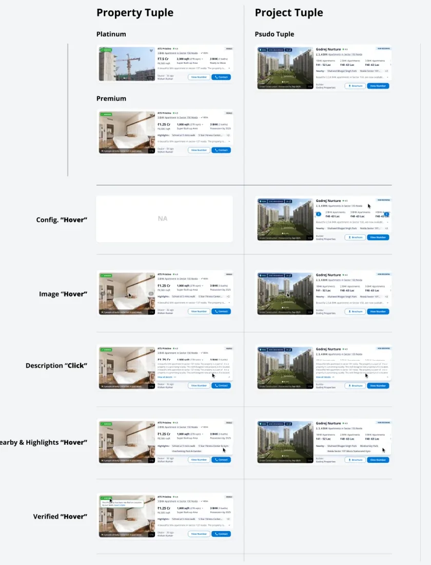
Go deeper: the discovery engine & the photo-trust finding
Alongside the form we built a second engine: an anonymous intent profile that sharpens with every positive and negative cue, then serves a deliberate mix of converging recommendations (narrowing toward the forming intent) and diverging ones (keeping exploration open). Search answers the question a buyer can phrase. This helps form the one they can't yet.
The cross-cutting finding: on a results page, the single thing that moved trust most was the photo, and across millions of listings it was wildly uneven. The card system above exists to stay believable across unique photos, reused photos, no photo, and floor-plan-only.
07 /What I take from it
The design was the easy half.
Alignment was the work: one objective instead of scattered pockets, and stakeholders convinced with evidence rather than opinion. That is how a rebuild of the business's core surface shipped, and paid for itself.
Role and credit: search strategy and design led end to end by me, mentoring the design team, with partners across product, engineering, analytics, research and legal.
Ask AI about this case Live
Answers come from what this case actually says. Pick a lens, ask as many as you like.
Summarize this case
1. 99acres' search was built in the shape of the company's org chart, not the buyer.
2. As the design lead I earned the right to rebuild it, turned the form into a conversation, and folded the monetization work into the core objective instead of separate pockets.
3. Desktop conversion went 0.6% to 2.36% (+290%), proven by experiment, not opinion.
Show every metric
- Desktop conversion0.6% → 2.36% (+290%)
- Mobile search & filters+27–32%
- Winning A/B variant2.0–2.3% vs 1.3–1.8% (projects in results)
- Leads from search90%+ of all platform leads
- TrafficMillions of sessions a month · ~60% organic · ~10% directly targetable
- Accessibilitycontrast 1.92 → 12.63 : 1 · targets 32 → 48px (AAA)
- Research60+ interviews · telemetry across millions of sessions
- Audience95% returning · 87% aged 18–44 · 62% on mobile